Practical tips from Faith Liversedge on the dos and don’ts of using stock photography to ensure your advice firm’s website maximises its impact.
Remember the last time you went to the beach and saw all those over 60s laughing at nothing, throwing their hands in the air, while wearing perfectly blended pastel casuals?

No?
Maybe it’s because real people don’t actually do these things. Not even really happy retired people. (No matter how good your financial planning is!)
So why are these images so prevalent on financial websites? Because they’re the go-to: they are easy to find, cheap to use and generic enough to tick the box marked ‘retired people’.
It doesn’t require much thought.
And a few years ago, you might have been able to get away with this. But not now. Now this kind of thing has the potential to undermine the integrity of your message, your brand and your business.
Why? Because nowadays people are receiving much more nuanced, personalised marketing messages that are more reflective of who they are.
But do we really want real people?
Using images of real people can look a little messy.
No one actually wants to see themselves as they really are. We want to see a polished version of that – something more aspirational looking. Particularly if we’re being encouraged to spend money.
So we need to strike a balance between the perfectly coiffed, immaculately dentured, white middle class boomers who look as if they were once part of Pan’s People, and the sorts of grittily realistic photos you find in the windows at Tesco.
So we’re going to go back to stock photography
Because the truth is, there are plenty of stock images that aren’t corny and can work very well when creating a certain image. You just need to be able to choose them wisely and use them in the right way. Here are some tips:
Create a visual theme for your website or brochure – this will help to tie everything together. This could be a common colour, a specific background colour, or something more abstract like water or mountains.
Customise your images by using a specific filter – this will standardize the overall tone of your images and make them feel like a cohesive group.
Change the shape – making your image into a circle or hexagon helps to change the whole feel of an image by highlighting specific aspects of it. This can work particularly well if these shapes are also present in your logo.
Make them black and white – this is an effective way of making images look a lot more sophisticated and is particularly helpful when dealing with images of your team – particularly if they were all taken at different times.
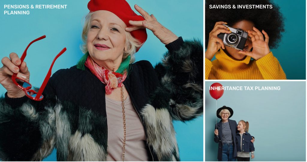
Add text – text on images can really help to personalise them and to add some context, and can instantly modernise the look and feel of your website or printed assets.
Crop or rotate images – homing in on certain interesting details can change an image dramatically. Flipping an image can help when adding text.
Choose pictures that look natural – choosing pictures that show genuine emotion can be difficult, but a good rule of thumb is to avoid images of people looking face-on into the camera, unless this is a deliberate style you’re going for.
Try to keep it simple – don’t choose anything with too much going on in it otherwise it’s hard for people to take in the meaning behind the message.
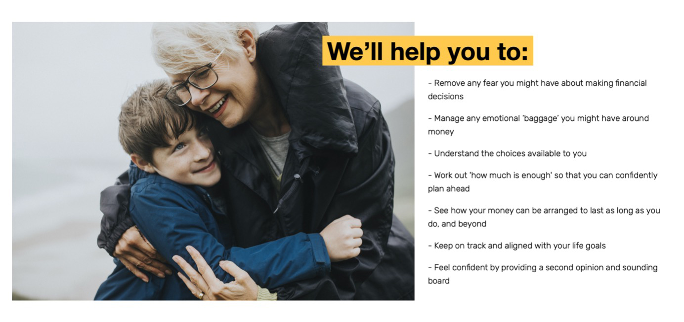
And what is the meaning? Well, what we want potential clients to glean from all this is that you help people like them. So if you work with high net worth clients you need to feature people like them, if its generations of families, that too.
A picture is worth a thousand words, as the saying goes. Especially these days when our attention spans are shorter than ever. An MIT neuroscience study found that the human brain can process images seen for as little as 13 milliseconds — just over 1/100th of a second.
This is useful when we think that apparently it takes 5 seconds to make a decision about whether to hop off from a website or not.
The more authentic the image, the more approachable, genuine, trustworthy and credible you’ll seem. Now hopefully you know how to make every second count when it comes to the successful and effective design of your business’ website.
About Faith Liversedge

Faith Liversedge is an experienced communicator with a wealth of knowledge and understanding of the adviser profession. She was Marketing Manager at Nucleus for 5 years, creating innovative and award-winning campaigns. Before that she worked for Standard Life, Prudential and Royal London. In 2017 she set up her own consultancy to help forward-thinking financial advisers and planners to become more profitable through websites, communications and other laser-focused marketing techniques.